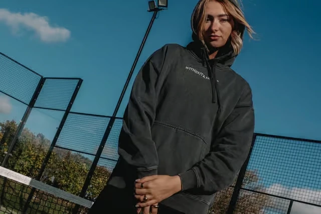
The Padel revolution is here, and it isn’t wearing tennis whites.
If you opened the Yorkshire Post today, you would have seen a familiar name making headlines. Without a Padel™, the Huddersfield-based streetwear brand founded by Isabel Mangham-Haigh, was featured for shaking up the UK Padel scene. The article highlights the explosion of the sport, from 15,000 players to over 400,000 in just a few years, and the demand for a fit that reflects the gritty, social, and chaotic nature of the cage.
At Bean Creative, we love it when our clients make waves. But before the headlines, there was a challenge. Izzy had a powerful brand story and a killer product, but her digital presence was stuck in safe mode.
Here is how we worked with Without a Padel™ to ditch the standard template and build a website that matches the hype.
When the Vibe Doesn’t Match the Visuals
Padel is not tennis. It’s faster, louder, and played in cages. It’s urban. Yet, when we first audited the Without a Padel™ online store, it felt… polite.
The brand was running on a standard e-commerce framework. While functional, it was “clean” in a way that diluted the brand’s identity. The navigation was standard, the typography was safe, and the energy of the court was lost in white space.
For a startup with zero paid marketing budget, relying entirely on organic social momentum, your website cannot just be a catalogue. It has to be an experience. It has to convert that Instagram energy into sales immediately, or you lose the customer.
[E-Commerce Web Design & Strategy]
The Brief: “Chaos in the Cage”
We sat down with Izzy to redefine the digital strategy. The goal wasn’t just make it look nice. The goal was to transmute the feeling of a Padel match into a user interface.
Izzy’s vision was clear:
“Tennis is sophisticated and prestigious; Padel is meant to be fun and freeing. I wanted a gritty edge… less tennis, more Padel.”
Our job was to translate gritty edge into code without sacrificing user experience (UX). We needed an industrial aesthetic that felt raw but functioned seamlessly for mobile users buying on the go.
The Solution: Designing for the Anti-Tennis Club
We approached the redesign with three core pillars:
1. The “Paparazzi” Aesthetic
Standard e-commerce photography is usually flat and perfectly lit. We threw that out. We utilised high-flash, high-contrast photography that mimics the harsh lighting of a night game or a candid streetwear snap. We integrated these visuals as full-width hero banners to immediately immerse the visitor. You aren’t just shopping for a hoodie; you are entering a club.
2. Industrial Typography & Micro-Interactions
To break the Shopify mould, we utilised bold, blocky typefaces that echo industrial warning signs and court markings. We stripped back the “fluff” copy and focused on punchy, direct language.
3. The “Zero-Friction” Funnel
While the aesthetic is chaotic, the buying process is not. We know that Without a Padel™ relies on social media traffic, users clicking a link in a bio and having 10 seconds to make a decision. We streamlined the path to purchase, ensuring that the “Add to Stash” journey was frictionless, specifically for mobile users.
Momentum Meets Conversion
The new site went live just in time for the brand’s major feature in the Yorkshire Post.
Now, when readers click through from the article or tap the link in Izzy’s bio, they don’t land on a generic store. They land on a digital platform that feels as established and confident as the big players like Adidas or Nike, but with a distinct Yorkshire edge.
This project proves a vital rule for e-commerce: Your website is your best salesperson. If it looks generic, your brand feels generic. But if you dare to design for your specific niche, you build a tribe, not just a customer base.
What This Means for Your Brand
The success of Without a Padel™ isn’t just about a great logo; it’s about alignment. Whether you are selling streetwear, services, or software, your digital presence must align with your real-world reputation.
If you are tired of your website looking like a template while your business feels like a revolution, it’s time to talk.
